

UX Audit is a procedure essential for the success of any company that is releasing a new product or implementing upgrades to products already available on the market.
Imagine that you have been running a successful online business for many years. At some point, however, site visits and the number of purchases or conversions drop significantly. This could be a sign that a UX audit needs to be done.
In this article, we’ll concentrate on the general subject of auditing, outline what an audit is, suggest when to conduct one, and describe the complete procedure from beginning to the end.
What is a UX Audit and when should you conduct it?
UX Audit is a procedure that allows us to identify all usability issues and help to find solutions. In other words, it is a process in which all aspects of a user’s interaction with a digital product are analyzed.
But how are they analyzed, and what does it actually mean?
Let’s imagine we are a company that owns a supply chain management app. We have been successfully operating in the market for many years and have acquired a lot of engaged customers. At some point, we decided to do a redesign, and since then, we have noticed that the number of downloads has been declining, although many people still visit our website. So, what could be the reason for this?
The most common reason is inadequate care of the overall user experience. This could mean that some elements on the page make it difficult for the user to interact with the product.
There are many possible reasons for conducting an audit; it may be the growing number of negative reviews of our product, the planned expansion into foreign markets and the related need to adapt the product to new requirements, which may involve planned budget changes and the need to analyze problems and set new goals, and many others.
For the purpose of this article, we will focus on an audit related to the redesign of the website, and discuss what might be causing bad user experience, and how we can fix it.
Unintelligible information architecture
An intuitive and comprehensible information architecture is the basis for the success of any website or application. Users visit websites to access information or perform specific tasks. A clear and well-organized architecture helps users quickly locate the information they need, reducing the time and effort required to find it.
Unintuitive navigation
Non-intuitively designed navigation can lead to users getting frustrated and, ultimately, to them quitting the action (e.g., the purchase of the product). Users are making decisions and performing actions in fractions of seconds, so if we force them to spend more time looking for the navigation or its elements, they will probably abandon the action and start searching for the product on other websites.
Content not adjusted to the target audience (including demographic and cultural aspects):
Different user groups typically have specific needs, preferences, and expectations when dealing with digital products. What appeals to a younger audience may not necessarily be effective for older users, and what resonates with one cultural group may not necessarily be compatible with another.
User demographics have a big impact on how people interact with a product. Age, gender, education, and income level are just a few variables that might affect how users behave and how comfortable they feel while using technology. That’s why digital products should be designed with cultural nuances, beliefs, and language preferences in mind to make sure they are appropriate and sensitive to different cultures and demographics.
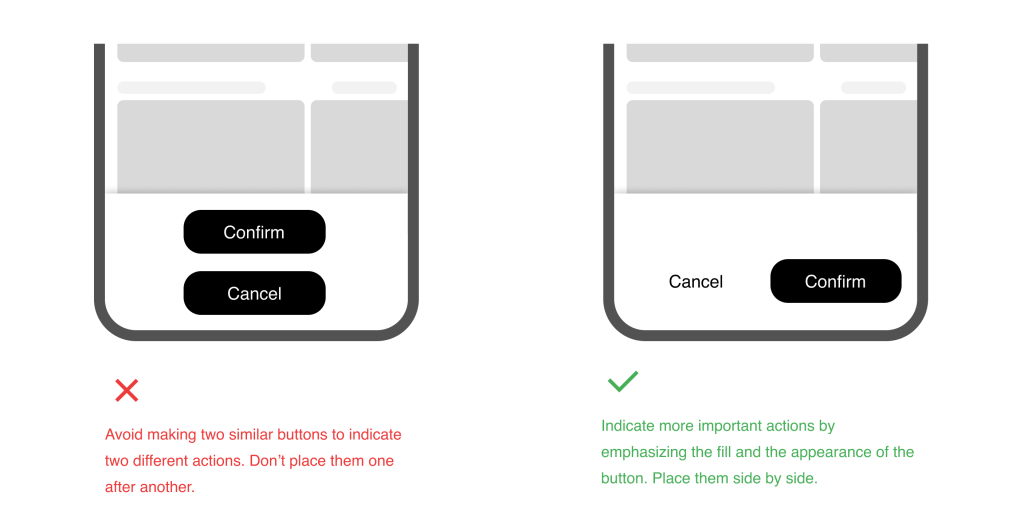
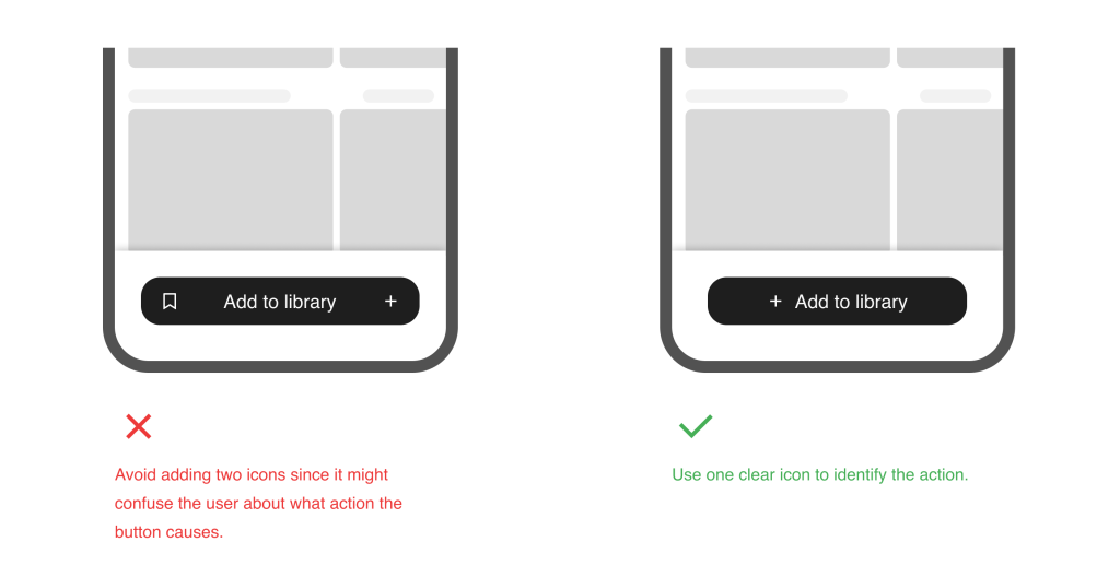
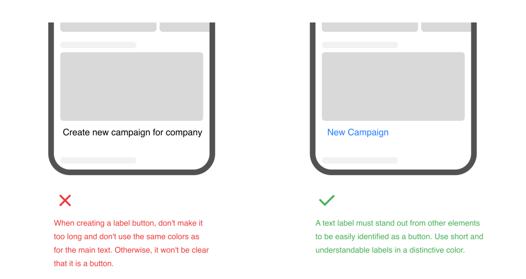
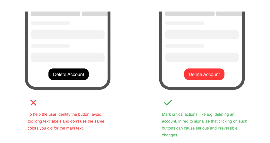
Poorly designed CTA buttons
CTA buttons are among the most important elements of any website or app, as they shape the user’s path. Non-intuitive design, the use of incorrect colors, and the lack of hierarchy can create chaos and confusion for users, ultimately leading to them abandoning an action or taking an action they don’t intend to take.
Broken links
Links are a fundamental part of website navigation. They help users explore the site, find information, and move from one page to another. Broken links disrupt this navigation, making it difficult for users to access the content they seek.
A website with broken links can appear unprofessional and unreliable, so checking all links and buttons containing references to other pages is important. A missing or an incorrect link can confuse the user or be a frustrating trigger to abandon the action because no one is likely to engage with a website that doesn’t work as it is expected to.
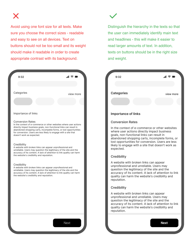
Illegible fonts
Consistency of typography is crucial for a harmonious and visually appealing design. Limiting font choices to one or two typefaces used effectively across all pages and screens is best. Prioritizing legibility over style ensures that the chosen fonts can easily be read on different devices and display sizes.
Establishing a clear hierarchy of information using font variations such as bold, italic and different sizes, helps highlight important headings while maintaining the readability of the main text. Responsive typography effectively adapts fonts to different screen sizes for a seamless user experience.
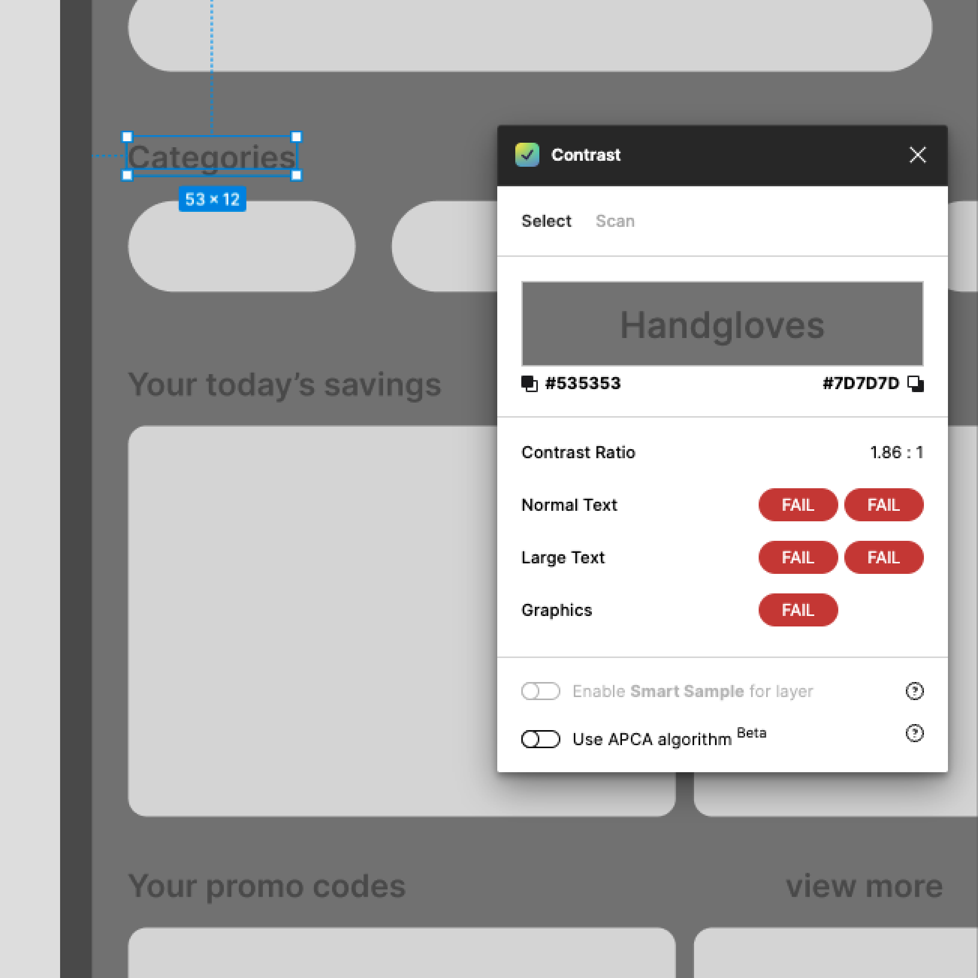
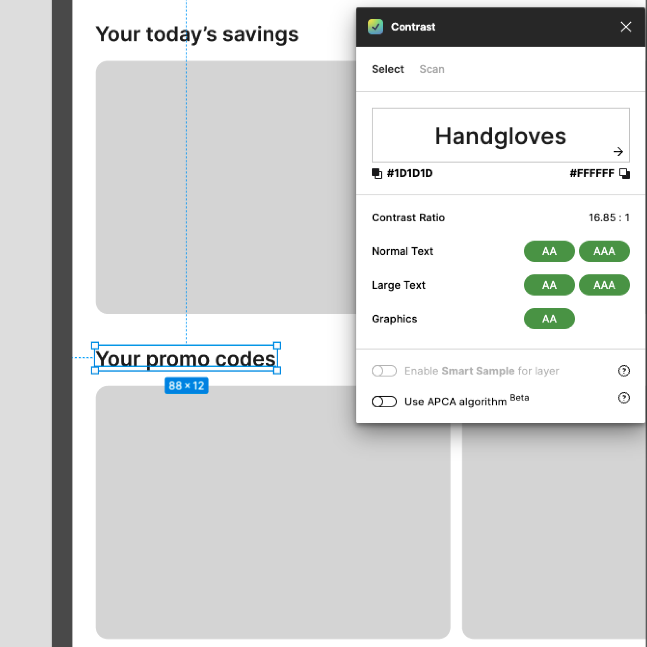
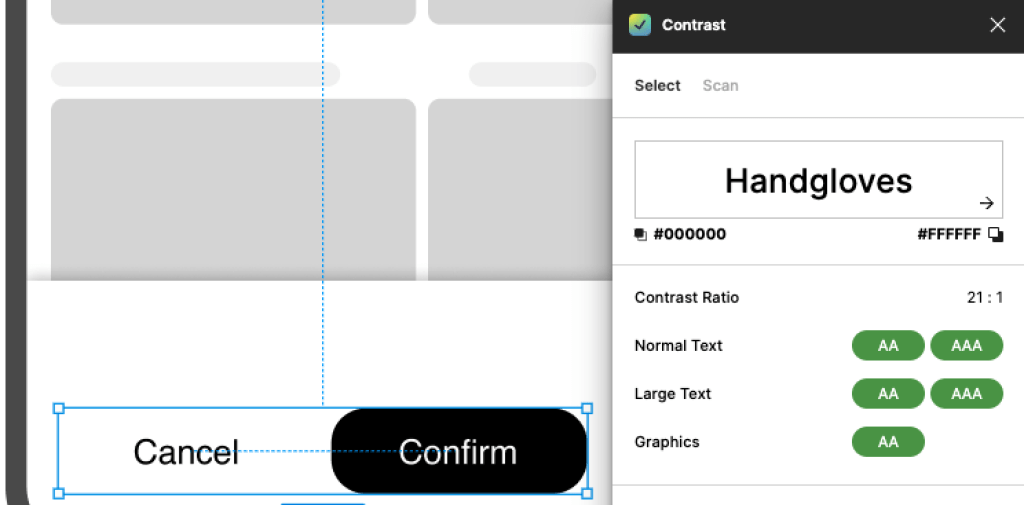
Finally, accounting for font accessibility by considering factors such as contrast and font size, and testing your choices with accessibility tools, is necessary to ensure integration for all users, including those with visual impairments.
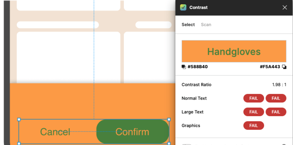
Incorrect use of colors
Choosing a color palette that supports the brand identity and evokes desired emotions is crucial. Think about how color psychology might influence decisions and make the best out of its potential by applying the following practices:
- Avoid low-contrast color combinations that strain the eyes by ensuring adequate contrast between text and background colors to ease reading.
- Create a visual hierarchy by emphasizing crucial components like calls to action and headings with different colors.
- Put accessibility first, by adhering to standards like WCAG and experimenting with color combinations to make them accessible to the users with color vision problems.
- Consider various devices and lighting situations to ensure the colors you’ve picked are still readable and effective.
- Establish color uniformity across your website or app to preserve a consistent look by recording and enforcing color choices in a style guide or design system.
The lack of compliance with accessibility
An important component of the user experience is accessibility. A digital product or website should allow users with disabilities to interact with it as effectively and independently as those without impairments. An accessibility UX audit determines whether a digital product complies with different accessibility requirements and WCAG recommendations.
Doing a UX Audit can help you align your digital product with the European Accessibility Act (EAA) and demonstrate your commitment to user-centricity and data protection. From June 2025, all EU member states will be expected to abide by the EAA – every platform, website, or web store obliged to comply with WCAG-level AA requirements.
UX Audit process in SolDevelo
This audit project was created prior to a planned redesign of one of our clients’ platforms.
- Scope and Objectives:
- Clarifying the audit’s specific goals and expectations.
- 💡Refreshing/modernizing the visuals to be more competitive.
- 💡Identifying Usability Issues.
- 💡Evaluation of User Flows.
- Audit scope, including the modules, features, and user flows.
- 💡Selecting the major modules that are most frequently implemented.
- Clarifying the audit’s specific goals and expectations.
- User Research:
- Identifying key user groups and stakeholders.
- Conducting user interviews, surveys, and usability testing to gather qualitative and quantitative data.
- 💡In case we don’t have access to the company’s users, we could perform the tests on various groups of people outside of their organization to validate the usability.
- 💡Gathering data that is available from the support department – requests, issues connected to usability.
- Documenting user pain points, needs, and expectations.
- Information Architecture Evaluation:
- Organization and structure of information within the platform.
- Assessment of the clarity and accessibility of menus, navigation, and content categorisation.
- Identifying opportunities for information hierarchy and findability improvement.
- User Flows and Workflows Assessment:
- Mapping out existing user flows and workflows within the platform.
- Identifying inefficiencies and areas of friction.
- Recommendation for improvements to streamline processes and enhance user efficiency.
- Usability and Interaction Design Evaluation:
- Assessment of the overall usability of the platform based on UX principles.
- Evaluation of interface elements’ clarity, consistency, and effectiveness (e.g., buttons, forms, notifications).
- Identifying areas of cognitive load, navigation complexity, and learnability.
- Visual Design and Branding Review:
- Evaluation of the visual design elements, including color scheme, typography, iconography, and overall aesthetics.
- Consistency with the client’s brand identity throughout the platform.
- Suggestions for enhancements to improve visual hierarchy, readability, and user engagement.
- Document Findings and Recommendations:
- Summary of all findings, observations, and insights from the evaluation process.
- Prioritization of the identified issues based on their impact and severity.
- Providing actionable recommendations for improving the UX/UI of the platform.
- Audit Report:
- A comprehensive report including an executive summary, methodology, findings, and recommendations.
- Visual examples supported by data-driven insights to back the findings up.
- Presenting the Audit Findings:
- A presentation to discuss the audit report.
- Explaining the rationale behind each finding and recommendation.
- Discussing the findings and further steps.
- Collaboration on Implementation:
- Working closely with the development team to support the implementation of recommended changes.
- Providing ongoing assistance and guidance during the design and development process.
- Follow-up usability testing to validate the effectiveness of implemented improvements.
Summary
UX Audit is a vital procedure for businesses introducing new products or enhancing existing ones. This comprehensive analysis identifies and addresses usability issues that impede user engagement and satisfaction. Triggered by various factors, including declining metrics, negative reviews, or market expansion, a UX Audit involves evaluating information architecture, user flows, design elements, and accessibility compliance.
The article outlines a detailed process exemplified by our company, emphasizing user research, documentation, and collaboration for implementing improvements. Ultimately, a UX Audit is a strategic imperative in ensuring a user-centric approach and a competitive edge in the digital world.