
SolDevelo has been involved in the GovStack project, focused on building an efficient ecosystem of solutions improving digital public services. One of our essential contributions to the initiative was developing a high quality GovStack UX/UI design.
In this article, we will analyze the evolution of the GovStack Testing Platform, and take a look at the initial goals, the development process, and the crucial points of cooperation between UX/UI designers, Product Managers (PMs), developers, and clients. We will also demonstrate how UX/UI design has changed the user experience and the final product through iterative design phases and constant cooperation with the team.
For more details on the project, check the full case study on the GovStack initiative on our blog.
The Genesis
The creation of the Testing Platform began with recognising the need to simplify and streamline the process of evaluating software compliance with various Building Blocks. Previously, data had been entered manually by company employees, making the process slow and lacking in automation. Therefore, the initial goals were clear:
Efficient Assessment
Users needed a way to assess software compatibility more efficiently and accurately. The process had to be simplified and provide a comprehensive overview.
Detailed Insights
Users needed a tool that could offer detailed insights into the compatibility percentages with particular BBs, including the ability to pinpoint where software failed the compatibility tests.
Streamlined Reporting
The platform had to enable users to generate comprehensive reports effortlessly. These reports would be used not only for internal reference but also for effective communication with development teams.
The Evolution of the Platform
The development journey of the platform was marked by collaboration, iteration, and a deep understanding of the established needs. It was evident from the outset that the UX/UI design played a key role in shaping the software into what it is today.
1. Collaborative Ideation
The collaboration started with brainstorming sessions involving UX/UI designers, PMs, and developers. Together, we outlined the primary user personas and identified the critical pain points and requirements. We translated these insights into initial wireframes.
Our first conception was to create separate tabs for products and BBs, but during brainstorming and creating Information Architecture, we’ve decided to drop this idea, and create one page for all products. We added a filtering option, aiming to give more freedom to users.
The main goal was to create an application that is simple, intuitive, and built with the user’s perspective in mind. That’s why it was so essential for us to reduce the clicks and actions a user has to perform to find what they are looking for. In the end, to get to the view with test results, the user needs to make only two clicks.
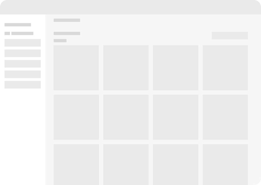
2. Wireframes and Mockups
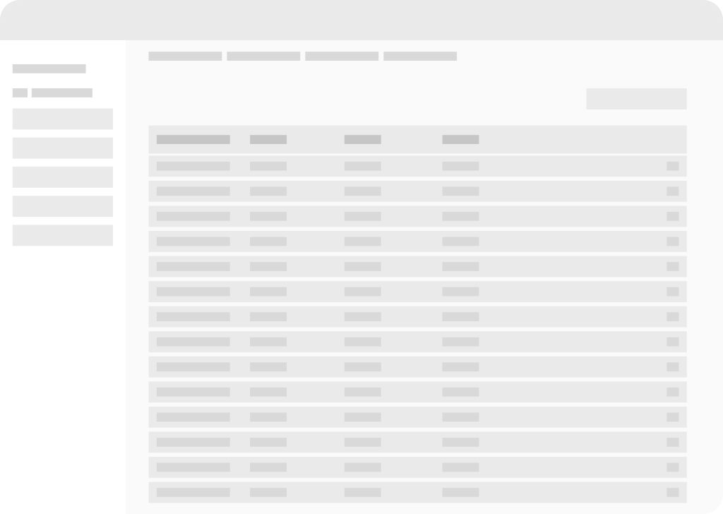
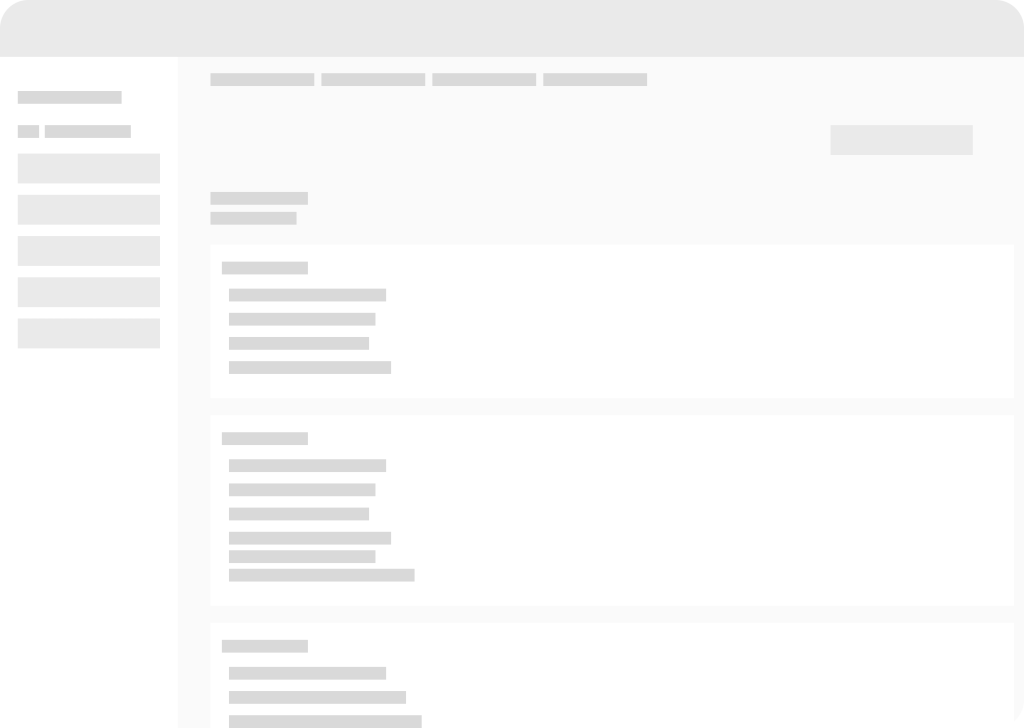
The wireframes provided a skeletal structure for the platform, outlining the layout, navigation, and key components. Initial mockups were a starting point for further discussions on the app’s direction. Later, with the development of the ideas and setting the next goals, we introduced the concept of a user-friendly dashboard with a clear hierarchy of information. The initial wireframes were changed into high-fi mockups, introducing color schemes, typography choices, and interactive elements. The main goal was to create an interface that is intuitive and visually appealing.
3. Design Iterations
Throughout the design process, we worked closely with the team to ensure all goals are achieved thus seamless user experience is included. The expertise in design principles and human-computer interaction contributed to the seamless integration of the visual aspects into the platform. The team constantly refined and adjusted the interface based on feedback from the client.
Below are presented both initial and final mockups – adjusted to the feedback received during recurrent meetings.
4. Feedback-Driven Enhancement
Regular feedback loops were essential in making the platform more user-centric. The cooperation between designers and developers helped identify any usability issues and bugs. The development team implemented these suggestions promptly, resulting in a more refined and user-friendly product.
The Role of UX/UI in Key Features
The user experience and interface design played a significant role in the following key features:
Dashboard
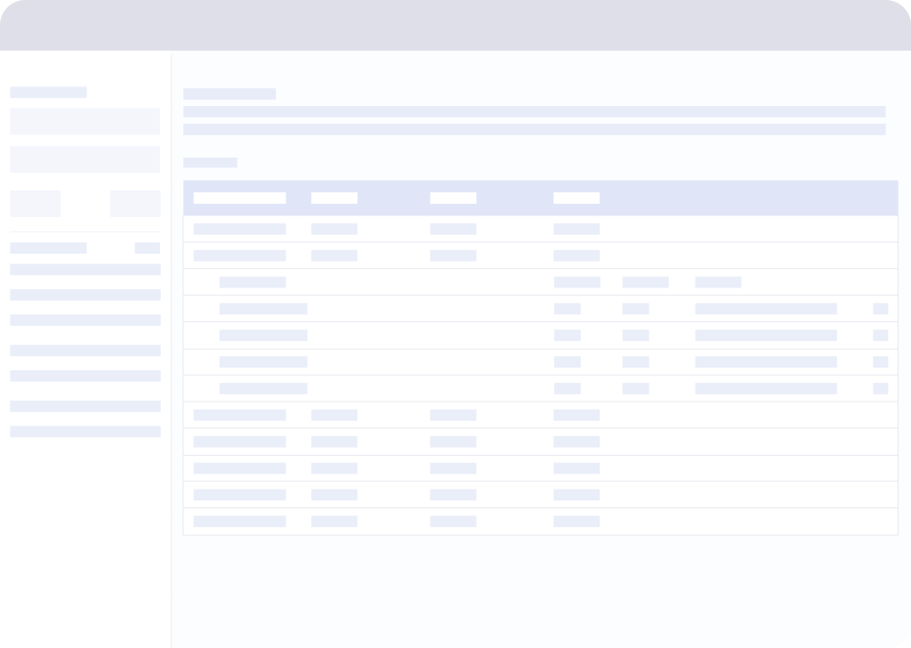
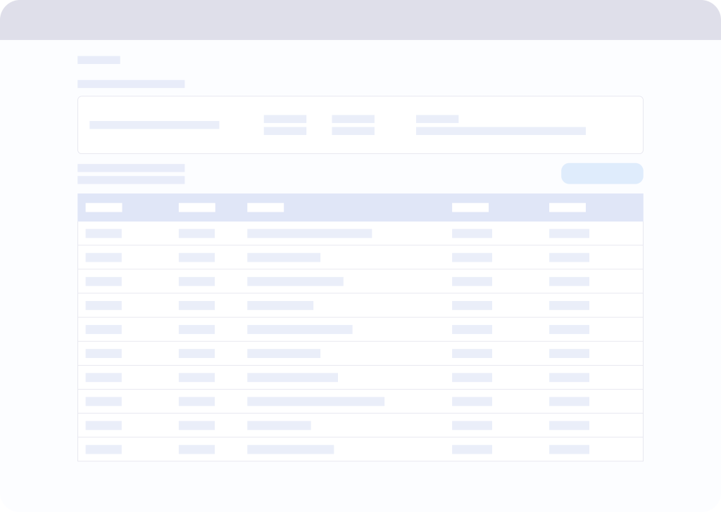
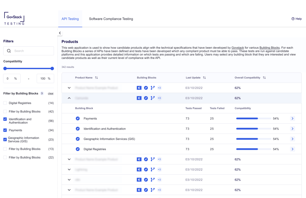
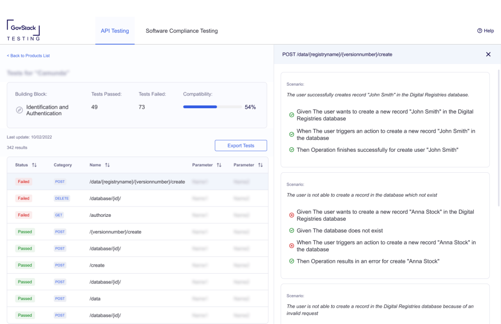
The clean and intuitive dashboard was designed to provide users with a quick overview of the latest compliance checks, addressing the initial goal of efficient assessment. To make it easier to compare individual products, we’ve decided to stick to the idea of using a tabular version of the dashboard instead of creating a tiled presentation of products and Building Blocks.
Filters and Search
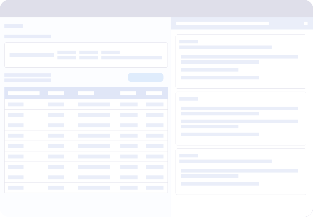
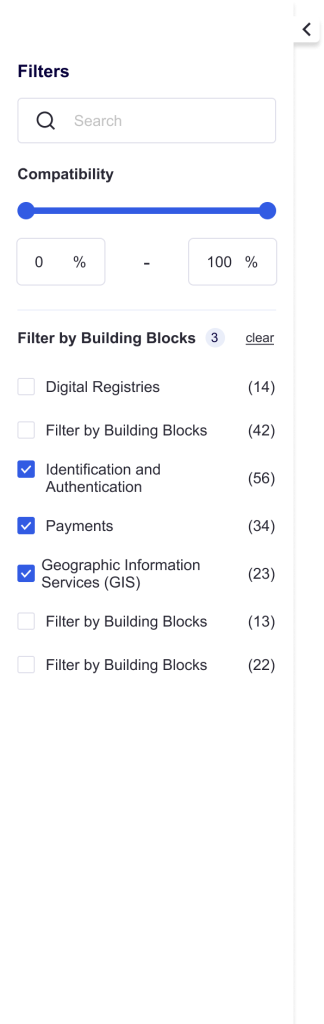
The filtering panel allows users to search for specific products, sort the results, and select compatibility ranges according to the purpose of the detailed insight. It is placed in an expandable panel on the left side and thus saves space for the most critical part – the table.
Detailed Compatibility View
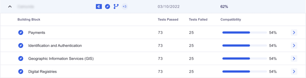
We made it possible to present Building Blocks compatibility in a clear and detailed manner, resolving ambiguities in compatibility details. Thanks to an expandable table, the user can see the overall level of compatibility and check compatibility with specific Building Blocks.
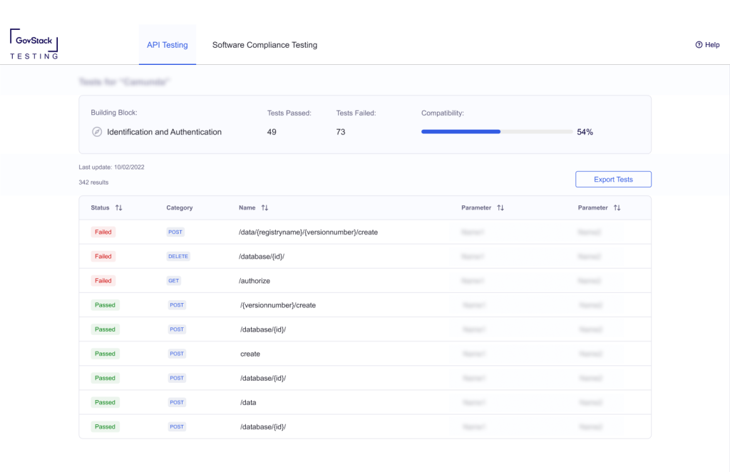
Test Reports and Insights
The ability to dig into individual tests and access detailed information resulted from collaborative design and development of successive app designs. Ultimately, we abandoned creating a separate view for detailed test results. Instead, the results are presented in a side panel that slides out from the right, allowing us to quickly move between tests without having to return to the list of tests, and by doing so, shortening the user path.
Comprehensive Reports
The report generation function has been automated. Users can now download a detailed report on the software’s compliance with particular BB.
The Final Mockups
Let’s take a visual journey through the final mockups to observe the transformation brought about by our UX/UI design team:
The mockups represent the initial design concepts, while the final app reflects the culmination of design, development, and collaborative efforts. As seen in the visuals, the platform has been carefully designed to provide a user-friendly interface that meets the initial goals of efficiency, detailed insights, and streamlined reporting.
Conclusion
The design of the GovStack Testing Platform is an example of the seamless collaboration between UX/UI designers and developers. From the conception of the idea to the implementation of the final product, each step benefited from the thoughtful integration of user experience and interface design. The outcome of this collaboration is a user-centered platform that simplifies software compatibility assessment, provides in-depth insights and fosters effective team communication.